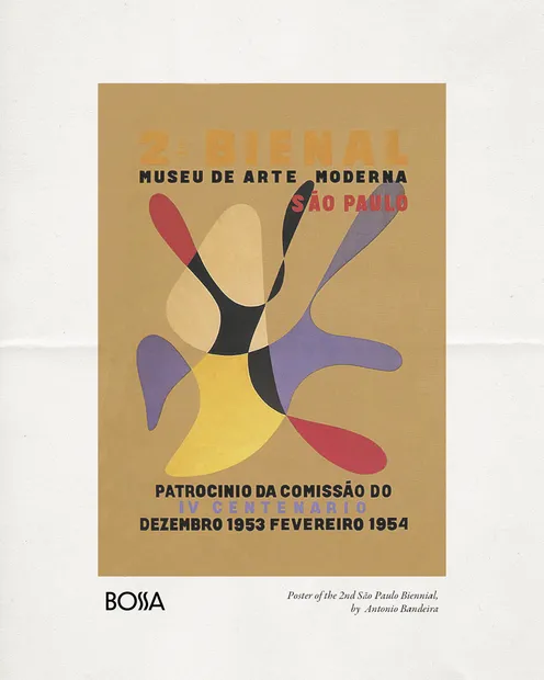
The Bienal de São Paulo reflect how Brazil has imagined itself in dialogue with the world over more than seventy years. Each design captures a moment, not only in the evolution of graphic language but also in the broader shifts of politics, society, and art.

The journey begins with the 1st Bienal (1951), whose poster by Antônio Maluf became a landmark in Brazilian design. Maluf’s composition of concentric radiating forms introduced a kinetic modernism that communicated dynamism, optimism, and the spirit of a country eager to assert itself as a cultural capital after World War II. It remains one of the most celebrated posters in Brazilian graphic history.

For the 2nd Bienal (1953–54), the commission went to Antônio Bandeira, one of the pioneers of Brazilian informal abstraction. His poster translated the energy of painting into graphic communication, contrasting with Maluf’s geometric rigor and highlighting the plurality of approaches that would define the Bienal from its earliest years.

The 3rd Bienal (1955) poster, designed by Alexandre Wollner, marked a turning point. A student of Max Bill, Wollner introduced a rationalist clarity that aligned Brazilian graphic design with the principles of international modernism. His composition of progressive geometric forms emphasized order, precision, and abstraction, encapsulating the Bienal’s desire to present São Paulo as a stage for cutting-edge dialogue between art and design.

By the 9th Bienal (1967), created by Gobel Weyne, the poster embraced the influence of the Swiss school. A minimalist grid and the reduction of the number “9” into nine squares conveyed both institutional authority and conceptual elegance. This was a decade of intense political turbulence in Brazil, and the Bienal’s clean, international image underscored its role as a resilient global platform.

The 14th Bienal (1977) carried a more openly political message. Designed by Regis Cardieri, its thirteen torn strips of white paper symbolized censorship under the military dictatorship. At once simple and forceful, the design became a statement of resistance, reminding viewers that the Bienal, even constrained, remained one of the few spaces where artistic freedom could still resonate.

In the 23rd Bienal (1996), the institution turned to the work of an artist: Louise Bourgeois. Her drawing, so compelling that four versions of the poster were produced, placed art itself at the center of the Bienal’s identity. Bourgeois’s imagery—psychological, intimate, yet universal—gave the Bienal a face that transcended design conventions, emphasizing the international stature of both the event and its participants.

Finally, the 31st Bienal (2014) presented a radical contemporary shift. The poster, designed by Indian artist Prabhakar Pachpute, depicted a tower powered by human bodies, framed with hand-drawn typography. Developed in collaboration with designers Aninha de Carvalho and Felipe Kaizer, the identity echoed themes of labor, collectivity, and global interconnection. It mirrored the Bienal’s curatorial concept, “How to Talk About Things That Don’t Exist,” and showed how poster design had evolved into a form of visual storytelling deeply embedded in the exhibition’s critical discourse.

Together, these posters illustrate how the Bienal de São Paulo has continually reinvented its image. They are not merely announcements of an exhibition, but reflections of Brazil’s cultural aspirations and of the Bienal’s enduring role as a space where art, design, and society converge.